Visual brand identity
October 2020, article
Amare’s brand strategy and visual identity were created by Silo design agency, based in The Hague. Amare initially invited twelve agencies to compete for the job of creating Amare’s unique look for all its communications. In the end, Silo’s proposal clearly won first place.
Mieke Beljaarts, head of marketing at Zuiderstrandtheater and Amare: “Amare is going to be home to a splendid collection of high-value cultural brands, and a creative, educational and professional meeting place. At the same time, we want to eliminate all thresholds to become an attractive spot for all the city’s residents and visitors, where everyone feels at home. This requires clear positioning and a recognisable identity. Silo’s enthusiasm helped convince us of their approach and creativity. It’s also great that they are a party that’s truly at home in The Hague.”
Silo held workshops and interviews with Amare’s future residents (Zuiderstrandtheater, Residentie Orkest, Royal Conservatoire and Nederlands Dans Theater) and other stakeholders to formulate Amare’s brand values and to shape its visual identity. The results can be viewed in the brand book.
Visual identity
A visual identity is more than just a house style. An organisation’s visual identity comprises – among other things – its logo, its colour palette, how it uses videos and photography, its tone of voice and typeface. In short, everything that defines Amare and makes it recognisable in its communication.
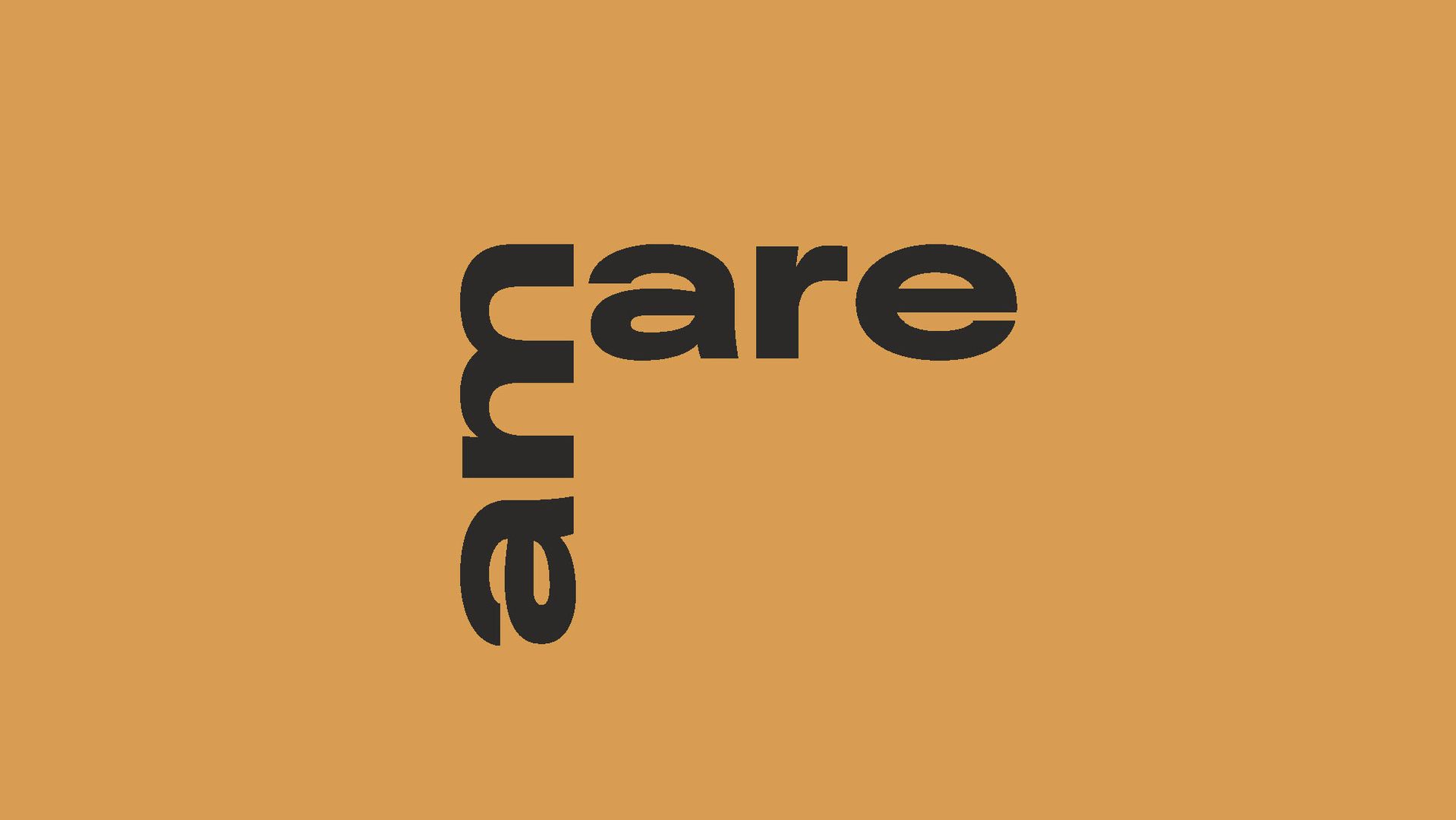
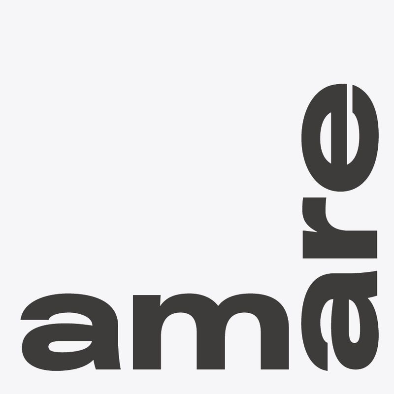
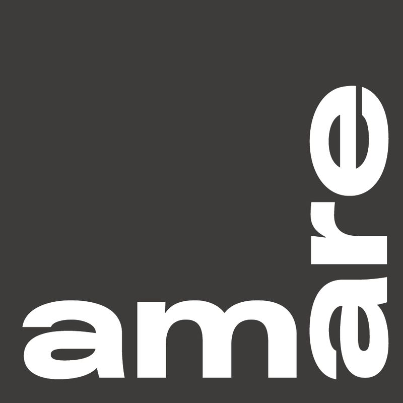
Logo
An open and playful form was chosen for the logo – a form that can shape itself around various kinds of content, as it were. By separating “am” and “are” from each other, the meaning of Amare is expanded, reinforcing the idea that the building belongs to us all.
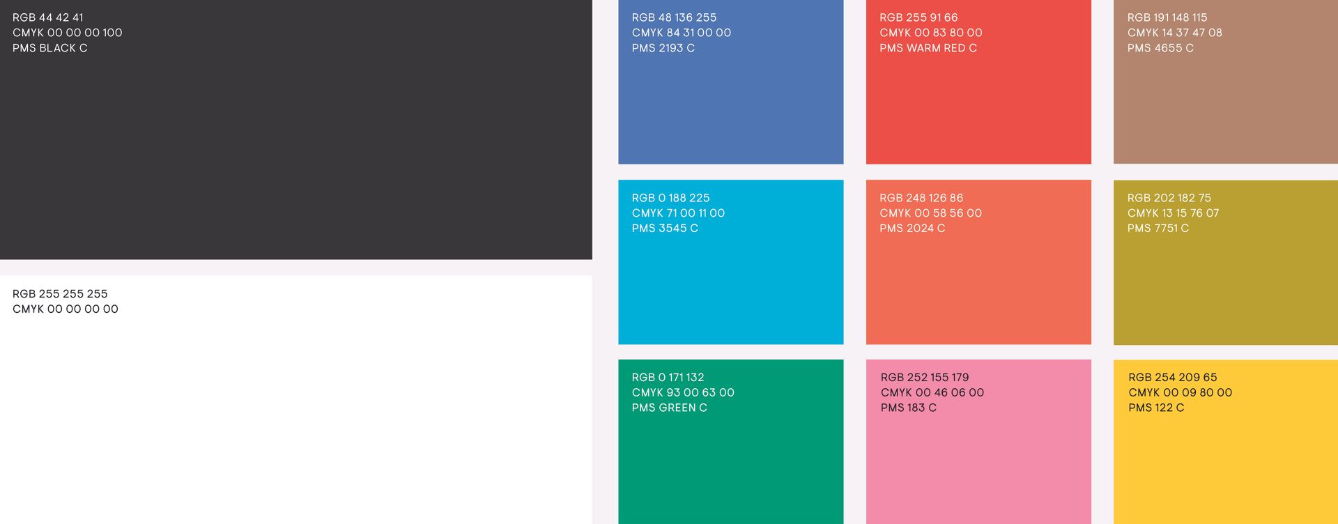
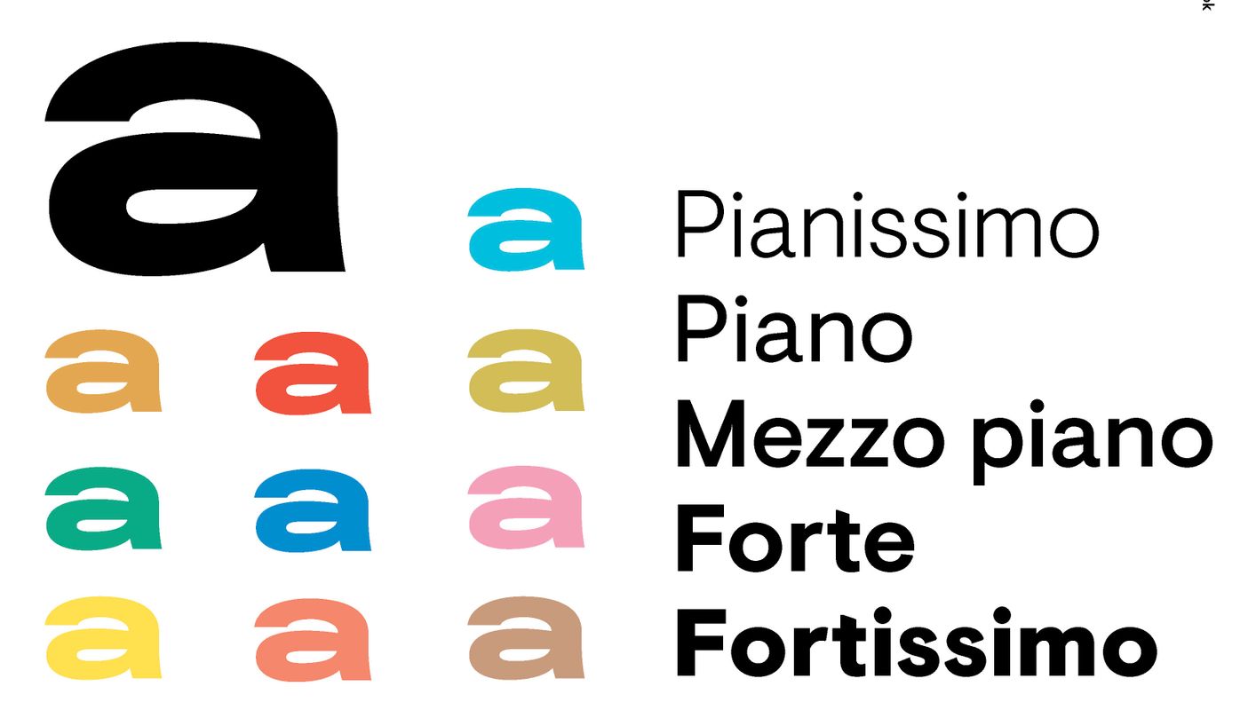
Colour
Amare is a colourful and diverse brand. Our brand values are expressed in our colour palette, which is inspired by the various colours and cultures in the city of The Hague, such as the blue of the sea, the sandy yellow of the dunes, and the many colours of the city.
Typography
Amare’s typeface stands out for its practical and flexible applicability. With a family of 14 styles and support in 60 languages, this makes the Visuelt font a good match for the brand.
Rene Toneman, Silo’s creative director: “Amare fulfils an important social function in the heart of The Hague. It brings top-quality performers and upcoming talent together with all the residents of the city. Amare is not only a location, but also a producer and a label. We are proud and excited to help position Amare as an attractive creative brand for everyone, and have shaped its identity to contribute to an overall experience that fits with the diversity and quality of the programming[BE3] , the makers and the city of The Hague.”
More Amare Stories